Writing Tips for Non-Writers 2: How to Write an 'About Me' Page
Want to add a personal touch to your business? Is your blog or portfolio missing that friendly element? Then an 'About Me' page is something worth exploring. Today, we'll go through how to write an 'About Me' page without being corny.

1. Decide how important your story is to your brand.
If you're reading this, you probably work solo (or as part of a small team like Ironeko). In that case, you can afford to attach your own story and personality to your brand.
Is there an interesting or inspiring tale behind why you do what you do? Are your core values clear enough to be put in a short paragraph? If one or both of these things are true, then good! But does sharing it feel appropriate?
For example, if your craft is based in self-expression (eg. music or visual art) your customers probably will want to hear it, as they're buying into what's unique to you as a person. And even if you don't think it's relevant, most customers want to make that connection.
If you do decide to have a more personal-story-based 'About Me' page, don't forget to also include the basics, like the city you're based in and any relevant qualifications.
However, if your service is largely functional (eg. server maintenance or events management), it might be less appropriate to share what inspires you or the town you grew up in.
In this case, you can still have an 'About Me' page - but centre it around the facts and maybe a sentence or two that encompasses your core values. Short and snappy is the key.
2. Decide between 1st and 3rd Person
When figuring out how to write an 'About Me' page, the Third Person might not occur to you as an option. But some people do it, and it can be done well. It just depends on what kind of tone you want.
First Person has a casual tone and immediately establishes a relationship with the reader. But it can come across as corny if you try to be too friendly.
Third Person is a potentially colder approach, but has the advantage of sounding more professional, as if someone in your team wrote the bio for you.
A great example in the First Person is photographer Mike Kelly's bio on his portfolio. Evidently, Kelly knows how to write an 'About Me' page that's welcoming without being saccherine:

Below this, he also details his education and career achievements (maintaining his anecdotal tone throughout) but the start is what I want to point out as great here.
Notice that his friendliness doesn't come through by use of silly language like 'hey there!', or 'I'm just a guy who thinks X is cool...' It comes from sincere confessions, like mentioning his airplane obsession, and complimenting his teachers.
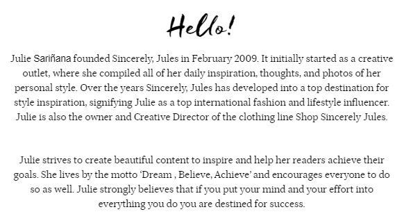
And for a successful use of the Third Person perspective on an 'About Me' page, take Julie Sariñara's fashion and lifestyle blog Sincerely Jules:

Here, the Third Person approach is a great choice because Sariñara has the accolades to back it up. It also includes a quote of her personal motto (and is titled simply Hello!) to add personality.
Remember, Third Person has gravitas because it's the illusion of being introduced by someone else. So if you're just starting out in your career, rely on your charm and use First Person instead.
3. Don't invent your personality - show it!
Remember, this isn't your CV. For example, don't tell them you're a designer who's passionate about... corporate stuff. Tell them what you're actually passionate about. Take these two options below:
A. I'm an experienced designer with a longstanding passion for providing an unrivaled user experience.
B. I'm an experienced designer specialising in user experience - and jokes from 80's movies that no one remembers...
Whether you like 80s movies or not, which sentence do you actually believe? While Option A can be plucked from a thousand CVs and LinkedIn bios, option B displays a fully rounded person, who also has professional experience.
Take Adham Dannaway's exemplary 'About Me' page:

Without even a mention of his name in this bio, we get a good sense of who Dannaway is. He uses a personable photo, all lowercase letters in 'about me', and he mentions the hobbies he indulges in in his spare time. All of this serves to create a welcoming charm.
Notice how this charm is complimented by a sense of professionalism - i.e. correct text-hierarchy, pleasant font choice and a high-res photo.
If you're not a designer like Dannaway of course, you can enlist the help of someone who is. And if you don't feel comfortable using humour or mentioning things outwith your work-self, there are other ways to play with the formula.
4. Experiment
Not every good 'About Me' page is experimental. But a lot of the ones that stick in your mind certainly are. And I don't mean do something "wacky" for the sake of it - just play with the format. For starters, you don't need to even call it 'About Me'.
You could name it 'Hello'; 'Meet [insert name]'; 'Me'; 'My Story'; or simply 'About'. And if your desired tone is super friendly, you can even title it something like 'What I'm All About'.
Make several drafts, and most importantly have fun with it. Take Ironeko's 'Who Are We?' page for example, which is minimalist in its content and design but includes a bio for the office cat.
So there you have it. Hopefully this stirred up a few ideas on how to write an 'About Me' page that's memorable and reflective of who you are. For further inspiration, look at 'About Me' pages from other people - and specifically successful people in your field.
If you dug this article, check out the first in this series to learn how to write a professional email, which will help you keep those all important clients in the long run!
