Web Design Inspiration #1: Functional and Beautiful
There is one thing that I see people asking for over and over in all the communities I post in: realistic examples for web design inspiration. These are really hard to come by. I'll usually see suggestions from sites such as Awwwards - and while these sites can be beautiful, more often than not their usabilty falls short. Of course there's a place for both beautiful and functional websites, but I think people have a harder time pinpointing good UX.

This is why I want to start this Web Design Inspiration series by showing off some of my favorite sites. These have been handpicked for their ability to look sharp and modern while not sacrificing UX for style.
I am Steve

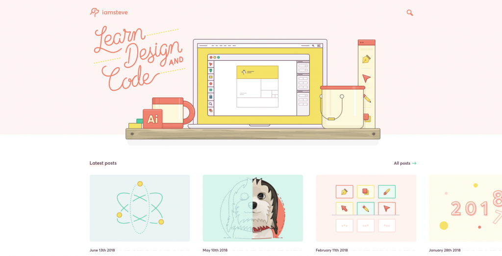
I am Steve is a blog about design, illustration and web development. While the site has been entirely inactive for a little over a year, it still stands as a fantastic example a good relationship between style and function.
Steve McKinney, who runs the site, shows something that I think is fundamental when creating a personal site / portfolio / blog: playing to your strengths. Your personal site has to be about you, so it needs to reflect your personal skills. In Steve's case that strength is illustration, which takes a central role in his design. Icons, thumbnails and images are all custom made illustrations. These help give the site a more consistent aesthetic as well as showing off what his skills are.
Aside from that, the site is a beautiful mix of tips and tutorials and jam packed with useful content. This was actually what inspired me to start ironeko, so I have a great deal of admiration for Steve.
Daniel Korpai

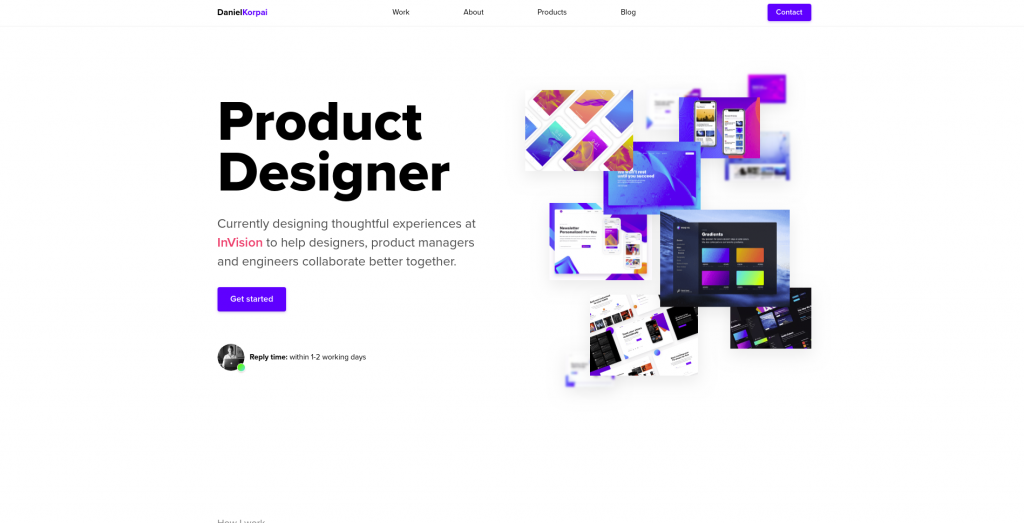
Daniel Korpai is owned by Daniel Korpai (duh), a designer for InVision. Korpai has a vast range of skills which are prominently displayed through his portfolio.
With a background in Product Design as well as Front-End Development and UX, Daniel does a fantastic job at showcasing all these skills. The site is full of animations, from subtle ones on static elements to using gifs to showcase his animation concepts.
The design is clear with a few colors that help highlight important interactions. Hierarchy is clear thanks to a clear distinction between headlines and paragraphs. It's just a pleasure to read through and explore.
If you're looking to create a portfolio that will last you for years then this is perfect for you. It's simple but still sleek. And the care put into the smallest details ensures it will still hold up despite design trends changing.
Gmunk

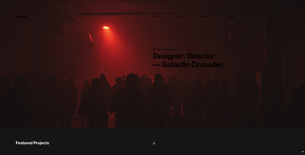
This is the portoflio of Bradley Munkowitz a cross-discipline designer that has worked on a lot of popular stuff. You might know him from having created the default Windows 10 background.
Gmunk is very different from the two other sites I mentioned above, but it's because of this that it's excellent for Web Design Inspiration. Munkowitz isn't a UX designer, he's not a Web Designer, his works centers mostly around installations, photography and film. I find it only natural his personal portfolio would lean more towards the artistic side.
Bradley Munkowitz' portfolio is built around a very clearly defined personal aesthetic. This allows his site to compliment his work perfectly.
Utilizing a fusion of science-fiction themes, psychedelic palettes, and practical in-camera effects, his signature style is enigmatic, atmospheric, and metaphysical.
https://gmunk.com/Information
This is an interesting case study, especially if you are a more traditional artist in need of a personal site. Your style and aesthetic can still easily shine through on your portfolio without breaking too many website usability standards.
Conclusion
I've been to a LOT of interviews. So if there's one thing I've started to notice, it's what people want to see from a portfolio site. Thankfully the web has evolved to a point where almost every art-related subject can be fully shown in website from. That is what you should be focusing when creating your portfolio.
Show your strengths, yes, and show your skills. But most importantly, build your site around and with those skills to do something striking. Making a portfolio allows you to break out from traditional site layouts while still creating a useful and easy to read website, so have fun with it.
